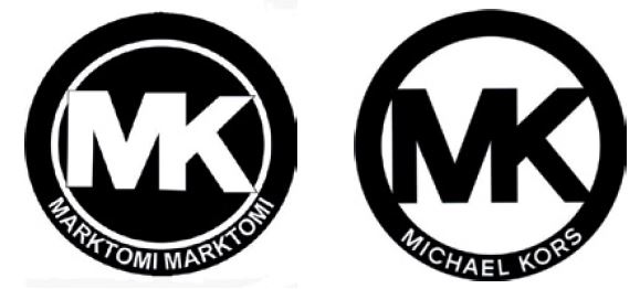
Michael Kors starts a cancellation against the Union trademark logo MK. The logo consists of the white capital letters MK, positioned large and centrally in a circle with black background. At the bottom it states ‘marktomi marktomi’ in small letters. Michael Kors has a similar logo, with black letters in a circle with a white background and at the bottom the words Michael Kors. The words at the bottom are clearly different and is this sufficient?
No, the Court rules. The letters MK are substantial. They are in the middle of a white/black circle. The letters are the eye-catcher and thus the dominant part. Visually, the marks are similar. Phonetically too, as most will pronounce the marks as MK. The differences between the words at the bottom are too little to neutralize this. The mark will be cancelled.
Avoid this kind of problem by researching the availability of a trademark beforehand.

